(Normally things in brackets are just little notes of my own, however quite a lot of notes throughout this post are notes I’ve made after I watched the film.)
Film posters are a lot like a peice of artwork, they often try and tell a mountainside of information to summarise the entire movie, but by showing it rather than just saying “This happened”. For this analysis I will be looking mainly at the film Brave by Disney’s Pixar Animation Studio’s, as seen below. This is a film I haven’t seen before (Despite pleading my parents to loan me money for a cinema ticket) so I will be forced to judge everything from an outsiders perspective, and in this poster specifically there is quite a lot to talk about in terms of the narrative symbolised and the sign’s they show.
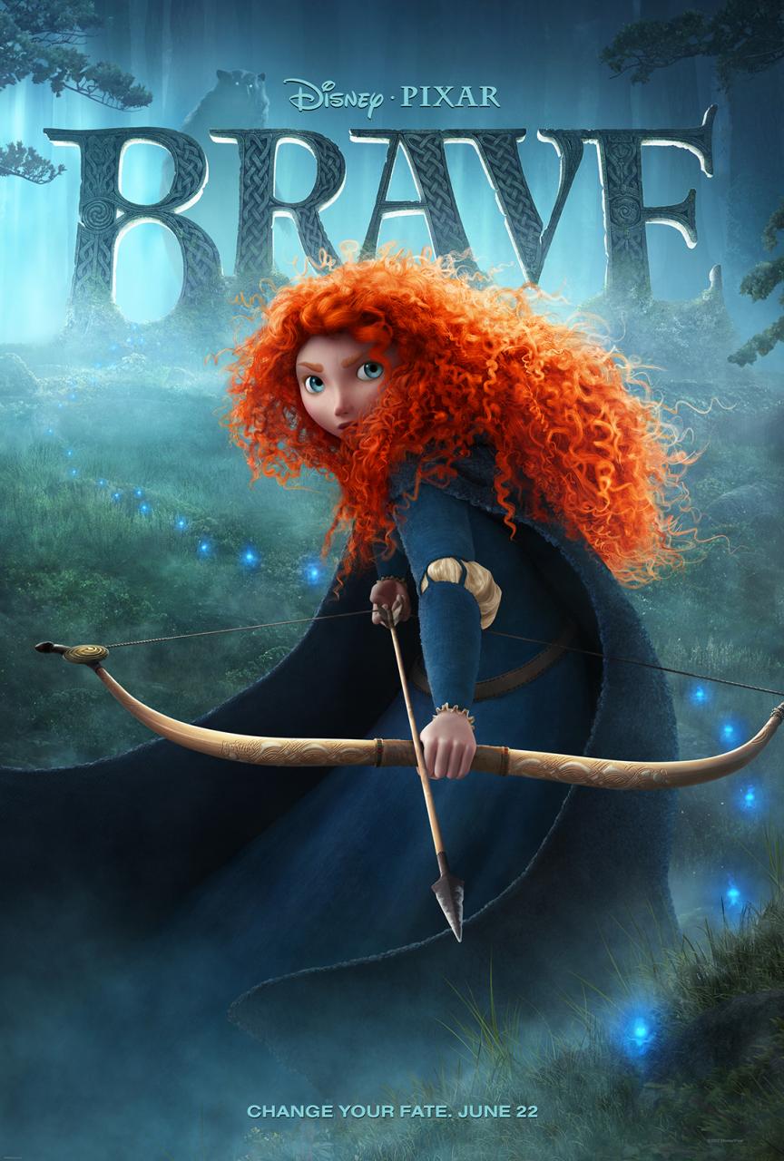
So my first emotional response when I looked at the poster was somewhere along the lines of “DISNEY!!!” and “oh, who are you?” I was immediately encapsulated by this character on the front who no-one had ever really seen before. we didn’t know who she was or what her personality was going to be and that almost made us look a little closer for clues and hints into the film and make us more actively engaged with the poster and more excited about the film.
But I’ll get to all that later, for now lets talk about the layout. The release information is extremely minimalist, with just the words “Change your fate, June 22” printed on the bottom. They appear to blend in to the rest of the poster by being really heavily blue, and this coupled with their size tells me that the designer didn’t want it to catch people’s attention so much. They needed it to be there, but not really in your face. The date is clearly just the date of cinema release for the film, regardless of how excited you are for the film if they don’t tell you when you can watch it, then you’re figuratively shooting yourself in the foot and losing a lot of ticket sales so it makes sense that is there. The other half though seems to be a sort of sub-heading which effectively sums up the whole film’s marrative as quickly as possible. Again they are trying to keep it minimalist, so they don’t really have the luxery of writing a blurb or paragraph to explain it. Not only that but by keeping it really short they bring about this air of mystery, enforcing what I was talking about earlier about this curiosity and wish to learn more of the film and character shown.
Another thing I really like about this image is how they have used multiple layers in creating it. It gives the poster a sense of depth and adds some character that would be impossible otherwise. With this we feel as if we are staring into a whole new world, whereas if we were to compare it to another poster below, it looks like a flat surface. We can’t get lost in this poster and while that isn’t nessecarily a bad thing, we watch brave for a completely different reason to lord of war, it show’s that they are both appealing to completely different audiences.

This style of multi layered imagery is also great because of the genre it is a part of. Fantasy film’s are well known for their settings and atmosphere, they are known for adding a lot of depth and reality to the world so by them using multiple layers in this way they have emulated that feeling. Again comparing the Lord of War poster, we can see they are focused towards a more straight forward message. “There will be guns, and there will be nick cage. Buy tickets now” This simpler approach is very well tailored to their target audience, they don’t want twisting turning narratives and deep compelling characters, they just want to see some explosions on a big screen. By showing this really narrative heavy peice of artwork we can see that the film is more suited to people who want this vast world to experience.
Following on from that we can see there is a mountain of little narrative hint’s throughout the poster. Almost everything has significance to the film in some way. There is a lot to talk about here because of this, but I will try to keep it somewhat brief (Well… brief for me) and won’t mention every things and filter out the details that don’t have as much significance.
Starting from the top, we can see what is quite clearly either a bear or a monster of some sort. I have a few notes on this, first being that it isn’t immediately obvious what it is. It is shrouded in fog, with it’s bright white eyes burning through it. This leaves the watcher… (player? no… viewer… that’ll do) this leaves the viewer a little unsettled by it, is it friendly or not? It’s sure big and quite scare surrounded by all that fog obscuring it’s features. However there is also rather a lot of contrast to this character in the eye’s. They look very round and sad, rather than vicious or scary. We can also see it to be behind the logo, as though it is trying to hide. This sends me the message that it is scared, it is worried of frightened. again reinforcing my thought on the eye’s. I get quite a lot of mixed messages from this character’s appearance, and that’s a good thing. It’s getting me curious and makes me ask questions, it also leaves the viewer walking away a little unsettled, because it isn’t completely logical. Why would a creature, so big and scary be afraid of anything?
Speaking about the Logo, there is a lot we can derive from this as well. First of all the words (or word rather) “BRAVE”. According to Dictionary.com, Brave is defined as “Possessing or exhibiting courage”, “Making a fine appearance” and “To defy, challenge or dare”. Taking these definitions and putting them into context, we can kind of see how the protagonist may be trying to be strong, and show that by going against the antagonist of the film (I was almost right, though she is really the contagonist not the antagonist. She want’s to see her become queen, not become Merida)
Then there is the font they have chosen, the pattern on it, and the fact it appears to be made out of stone. This gives me a lot of information as to the setting. The stone and Celtic Pattern places the film in old, OLD Briton, before the Romans happened during the Celtic era. This is a strange choice of setting because Celtic traditions, lore, beliefs and culture have all but been wiped out by this point and replaced with Roman culture and religion. This again builds up this curiosity and reinforces this “What am I looking at here?” feeling. Finally the font is this really old, almost Shakespearean font. This reinforces that we are to think the film is from a long time ago, though it is long past Shakespeare, I think this more of a trade off for using this font. This font will be well recognised as old and traditional, whereas maybe another older one won’t have that same effect.
Next thing down is we get to, who I presume to be, the protagonist. We can learn a hell of a lot from her. So from the top, her hair. The first thing I noticed is it is bright orange. This is great for adding setting as ginger hair was known to have originated in Scotland, this adds a greater sense of location to the image as we can get a very specific point in time and space that the film must be set in. On top of this it also is a great use of contrast… I’ll get to that later, that’s going to need a little more room.
We can also see how crazy and curly her hair is. Most people would just pass this off as her hairstyle, but I think they are trying to express how free the protagonist wants to be. She see’s herself as unrestricted and wild, rather the repressive person the antagonist (Contagonist sorry) is trying to force upon her (Going back to the name here) This is all great because it gives us hint’s towards the character and allows us to see who it is we are going to be following throughout the story.
Next up we are looking at her face. We can clearly see from her expression that she is somewhat worried, and the fact she seems to be hiding behind her hair tells me she is scared. This is a really deep contrast to the name of the film, Brave, and tells us that the character has some inner conflict throughout the story, and show’s us she is going to be a very complex character. Again this is appealing to people who like fantasy film’s because they often prefer more… sophisticated storylines and characters over aspects of other genre’s.
Slightly down from that we can see that she is wearing a really elegant, curvy, blue dress. This has a few good points to talk about, so I’ll begin with the colour. They have chosen to make the dress a polar opposite colour to her hair in contrast to each other, I think this is to also show the inner conflict that the protagonist will need to fight throughout the film.
We can also see that the elbow of the dress has been torn a little bit, this is a massive enigma code as we wonder how it happened? Could it be because of the monster in the background? But if so why is she facing the camera and not the monster? This is great because it get’s the viewer asking these questions and thinking about the film, or maybe even talking to friends about it and getting free advertising from word of mouth.
The dress itself is very regal and elegant, this gives us the impression that she is someone very important, or at least comes from an important family (called it!). This is reinforced by the fancy, small cuffs on her dress, they portray a sense of fragility and they contrast really heavily with the bow she is holding. Again showing this contrast and inner conflict, this is a pretty important theme through out the poster so it suggests that it is going to be a huge part to the story. And as I mentioned before, this is good because it is something the target audience is obviously looking for.
As a final note we can also see that the dress is very curved and feminine, given how heavy the theme of contrast is throughout this poster, I take this to be semiotic to how characteristicly masculine the protagonist is. This is great because it builds more character, and makes us think of the protagonist more of a normal human being and less like just a group of animated polygons. with a displacement map (Uh, animator talk for curvy shapes).
Next up we see the protagonist’s bow, and again we can see this Celtic pattern, helping to anchor the setting to a time we know in history. On top of what I mentioned earlier this also has the effect of giving the illusion that this story could be true, this illusion can help make the film just that little more magical and help us to connect with the characters just that little bit more, by reinforcing the fact they could be real people and telling us the protagonist could be someone in the world. (And after watching the film I realised that person was me… spooky)
Next we see the little blue things that seem to making a path in the poster, these are really mysterious and raise a huge enigma making us question what or who they are, achieving the same effect I mentioned with the tear in her dress. it also looks rather magical and that brings me to my next point.
Moving on from there, we see there are a bunch of symbols dotted throughout the poster, which due to all the evidence we have that Brave is set in Celtic Scotland, is assumed to be from Celtic Mythology. I’ll start with the symbol we see on the protagonist’s bow and an the B in the name. It is reminiscent of the single spiral mark which is said to stand for the “Radiation of ethereal energy” this ties in with the fog and makes me feel like this world is a place where magic is hiding in the shadow’s, and weaving their spells in the darkness away from the gaze of everyone else. Almost as though the witches are trying to weaving the yarn of fate and ties in with the tagline “Change your fate” to suggest the antagonist is a witch, weaving the fate of the protagonist and the protagonist is fighting against that to change all that. (Don’t ask me how I was this close, I have no idea. but it still makes it a great thing because it show’s just how much they reveal without telling the viewer. The fact I have found the majority of the plot with a little research before watching the film, show’s just how well constructed this poster is)
The other symbol they show us is the symbol on the E which I take to be the Triskelion. I take the Triskelion to stand for a cycle, how everything will repeat itself in time. However I can’t see this being that important to the plot in the end, and I can’t see how they would incorporate this into a film (Oh how wrong I was). Instead I think they taken it to mean motion, as though the protagonist was going on a journey and needed to move forward either, figuratively or literally, at some point in the story. Maybe she needs to move on after a broken relationship? Or she needed to move somewhere else on a quest? This meaning does make sense so I feel it is simply because they have a different representation to myself. We don’t really have concrete translations for these symbols, so it is very possible that they get a different message from mine.
Moving on from the Celtic symbols to my final point, the use of colour and contrast through the poster. We can see that blue is a very powerful colour used throughout the whole poster, everything from her dress to the background is blue, even the grass has a layer of blue over the top. This tells me that the setting is supposed to be rather calm and cool, by using this cold colour scheme of blues and turquoises we get this sensation of relaxation and safety. However this illusion is shattered by the fact that her hair is bright orange. I feel this has a couple of effects, first of all it is contrast, and therefore very eye-catching. Always a good thing for advertisements. Secondly it sends a message of conflict between the character and the world around her. Conflict makes for interesting story telling, so it is only a good thing that they are trying to showcase this. I think there is also a deeper meaning though, it isn’t just for interesting storytelling, it is to try and build the character as well. They want to show that the protagonist doesn’t fit in the world she lives in, she doesn’t feel like she belongs in her clothes or her position. Going back to my analysis of her hair maybe she want’s to have freedom but is bound by her social class stopping her from being the free spirit she wants to be.
So at the very bottom of that analysis I feel I have a good understanding of the film. Honestly after watching it, it’s a little spooky how close I was. The poster has shown to be a good example of the codes and conventions of a traditional fantasy film poster and that’s all I wanted it to do. I feel I have learned a fair bit during this analysis, there was a few things which I needed to think about long and hard such as other people’s interpretations of the Triskelion, I didn’t realise there were alternative representations, and so this was a very good exorcise for me (Plus I’m also glad I finally had an excuse to look for a DvD of Brave, potential new favorite movie… well besides tangled but I’m rambling so I’ll stop here.)

Phil this is great and detailed as normal but I still think it can be better. You still have the tendency to begin your work in a vague and chatty way. It doesn’t really get going until para 3, which you can’t afford to do in the exam. You know this.
Also you make some generalised assumptions about how audiences react without really defining the target audiences themselves. Further, try and incorporate more precise media language in your work, e.g when you say ‘reinforces this “What am I looking at here?” feeling’ you could talk about narrative enigmas.
Examiners won’t necessarily ‘get’ your style, so you just need to try to be a little more concise.
• Moderately complex ideas will be expressed clearly with some evidence of a personal interpretation.
• Good understanding of representation issues.
• Good exploration of relevant media concepts and debates using a range of appropriate examples.
22/30
LikeLike
Wow, can’t believe you’re able to get all that information just from that one poster, and so accurate as well! I wouldn’t even notice the bear’s sad eyes, or the patterns of her dress. The only thing I would write about, if I had to do an analysis, is her bold orange hair, and make a “hoity toity” reference to Sansom and the importance of hair. Did you ever get to see Brave eventually?
LikeLike
When I was writing this, I did a large part of the post before watching it, then amended it later on when afterwards. in a few notes. in review. On the detail, our job was too look at everything in the media text, because everything was put in deliberately and has a purpose. Honestly my accuracy was mostly luck, It could’ve been a bunch of things I seen, just had to guess more than anything else.
LikeLike
I don’t think it was luck, because you logically deduced what was going on! It was pretty impressive, especially how you noticed the bear’s expression.
I’m glad you were able to watch Brave!
LikeLike